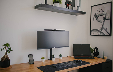
Browsing on a desktop with a large screen is easy. However, have you ever noticed a website working perfectly on a desktop but lacking quality and experience when accessed through a phone or tablet?
This issue arises when multiscreen strategies while designing are not considered while designing your digital products. Nowadays, users frequently switch between devices to complete their tasks. For example, you might pause a movie on Netflix on your tablet and then want to continue watching it on your phone.
The Challenges and Solutions in Multi-Screen UI/UX Design
In this context, you expect the same interface and experience on your phone as your tablet. Achieving this level of seamlessness and continuity is challenging and requires special expertise.
In this article, we’ll explore the challenges and solutions in multiscreen UX UI design.
What are multi-screen UI UX designs?
Today’s users access information on a variety of devices such as desktops, laptops, tablets, smart phones,, and smart watches. For designing seamless experiences across various screen sizes, contextual awareness is needed. Contextual awareness means understanding how users interact with your product on different devices and indifferent situations.
Challenges of multi-screen UI/UX design and it’s solutions
With plenty of screen choices available, users seamlessly switch between desktops, tablets, smartphones, and smartwatches. This demands a website or application that delivers a consistent and positive user experience (UX) across all these screens.
But how do you ensure your design and experience feels the same be it on a large desktop monitor or a tiny mobile screen? Below we’re sharing some challenges associated with multiscreen design and actionable solutions for multiscreen design success.
Maintaining UI consistency across screens (desktop, tablet, and mobile in multi-screen design)
Sometimes, you need to pause a task on your desktop and continue on your phone. In this case, having a consistent visual identity (colours, fonts, logos) and user experience (UI) elements (buttons, menus, layouts )across devices creates a sense of familiarity and makes this transition smooth.
To achieve UI/UC consistency across multi-screens you can establish a library of reusable UI components (buttons, forms, etc) and design guidelines for a unified look and feel.
Furthermore, creating a style guide documenting your brand voice, colour palette, typography, and other design elements for consistent implementation is also helpful.
Content Prioritization and Navigation
Cramming all your desktop content onto a small screen isn’t a wise decision. The key is to prioritize content distribution based on user needs and screen size.
To overcome this issue, you can utilize menus that adapt to various screen sizes like hamburger menus on mobile and dropdown menus on desktop.
Another way is to prioritize essential content on the initial load and reveal additional details through user interaction i.e. click to see more.
Cloud-based content management system for multi-screen design
In situations when you have to access information on both laptop or phone seamlessness can be affected. However, for seamless cross-device continuity you can utilize cloud syncing. Through this, you can ensure data (documents, shopping carts ) is automatically synced across devices. Login or cookies can also be used to resume tasks seamlessly while switching between devices. By following these tips you can overcome common multiscreen challenges and create a positive user experience that transcends screen sizes. Maintaining a seamless user experience across multi screens is the best way to keep users engaged and linked to your product or service.
Tools and Resources for Multi-screen UI/UX Design
Building successful multiscreen design requires the knowledge of the right tools and techniques. Here’s how you can choose the best approach for your project and streamline your workflow.
Responsive vs. adaptive design
The two approaches that best handle multi screen designs are responsive design and adaptive design. You must understand their weaknesses and strengths to choose the best pick. In responsive design, you use a single, flexible layout that adapts to different screen sizes. It’s ideal for projects with a consistent content structure and layout across devices. This approach is simple and efficient to implement, cost-effective and maintains a unified design language.
Content Prioritization and Navigation
Cramming all your desktop content onto a small screen isn’t a wise decision. The key is to prioritize content distribution based on user needs and screen size.
To overcome this issue, you can utilize menus that adapt to various screen sizes like hamburger menus on mobile and dropdown menus on desktop.
Another way is to prioritize essential content on the initial load and reveal additional details through user interaction i.e. click to see more.

